Students in grades 4-6 created these lovely winter cityscapes as an exploration into architecture, value and shading! We began by creating a unique cityscape- drawing homes or buildings and adding detailed architectural elements. These were drawn in pencil and then traced over with sharpie. For the background, I let students choose a color of paint and then create a gradient sky. We talked about the art element of value- the lightness or darkness of a color. Adding white to a color is called a tint and adding black to a color is called a shade. Students were to mix the colors and create a minimum of 5 different values in their sky. The final step was to cut out the cityscape and attach it to the value painting. We also used oil pastels in the same color to create some shadows on the buildings and white paint to add snowflakes.
Showing posts with label tint. Show all posts
Showing posts with label tint. Show all posts
Wednesday, February 13, 2019
Wednesday, February 7, 2018
Value Landscapes
Students in grades 4-6 created these beautiful winter landscapes exploring value and depth. We began by painting the sky. We learned about value- the lightness or darkness of a color. Students chose a cool color to paint the sky and needed to create a minimum of five values with at least two tints and two shades. We attached tissue paper to another white paper with glue water and cut that into triangles for winter trees. We talked about how artists use space in their artworks- objects that are closer are large and towards the bottom of the composition while things that are far away are smaller and higher towards the horizon line.
Tuesday, February 3, 2015
Contrasting Color Fish
Students in grades 4-6 created the contrasting color fish. We began by creating a stencil of a fish to outline. Students were to draw a fish with lots of details- fins, tails and an interesting shape. Students then traced the fish several times on the page in a way that shows visual balance. We then added lines that mimicked the movement of water throughout the composition. The fish were colored in with warm color markers and blended using a wet brush. Blue is opposite orange on the color wheel, so mixing different values of blue for the background created a nice color contrast to make the fish standout. Students learned how to create tints and shades of blue and again placed them on the composition in a way that shows balance. This was a great project to get students thinking critically about how to apply the principles of design to create a successful artwork.
Labels:
4-6 artwork,
contrast,
shade,
tint,
warm colors
Friday, January 30, 2015
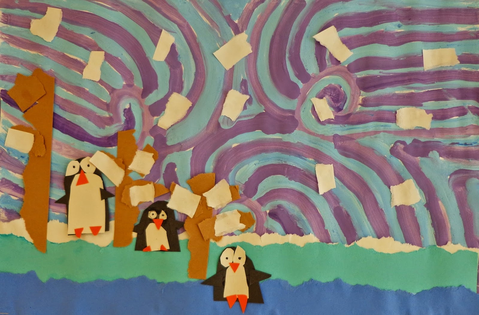
Penguins in Perspective
Students in grades 1-3 created these winter landscapes. We began by learning how to make tints of blue and purple. Students painted the background in a pattern of tints in a way that would show movement. Next, students tore paper to create the ground lines. We looked at different examples of aerial perspective and noticed how the colors are darker in the foreground and get lighter as you go back in space. Students then created trees and penguins that are larger in the foreground and get smaller as they go back into the middle and background. This fun winter lesson taught students perspective, how to mix colors and also how to show movement in an artwork.
Friday, December 5, 2014
Autumn Trees
Students in grades 4-6 created these autumn trees as an in depth study of color and value. We began by drawing out a grid in pencil and painting the shapes in a monochromatic color scheme. Students could choose one color and then create different tints and shades of that color to complete the painting. We then learned about atmospheric perspective- how in a landscape objects that are farther away become lighter and blurrier. Students then created three horizon lines and trees, the closest were dark while the ones farther away got lighter and smaller. This was a great lesson for teaching color theory- monochromatic, tints and shades as well as the concept of value and how it adds depth to an artwork.
Labels:
4-6 artwork,
autumn,
monochromatic,
shade,
tint,
value
Subscribe to:
Posts (Atom)


